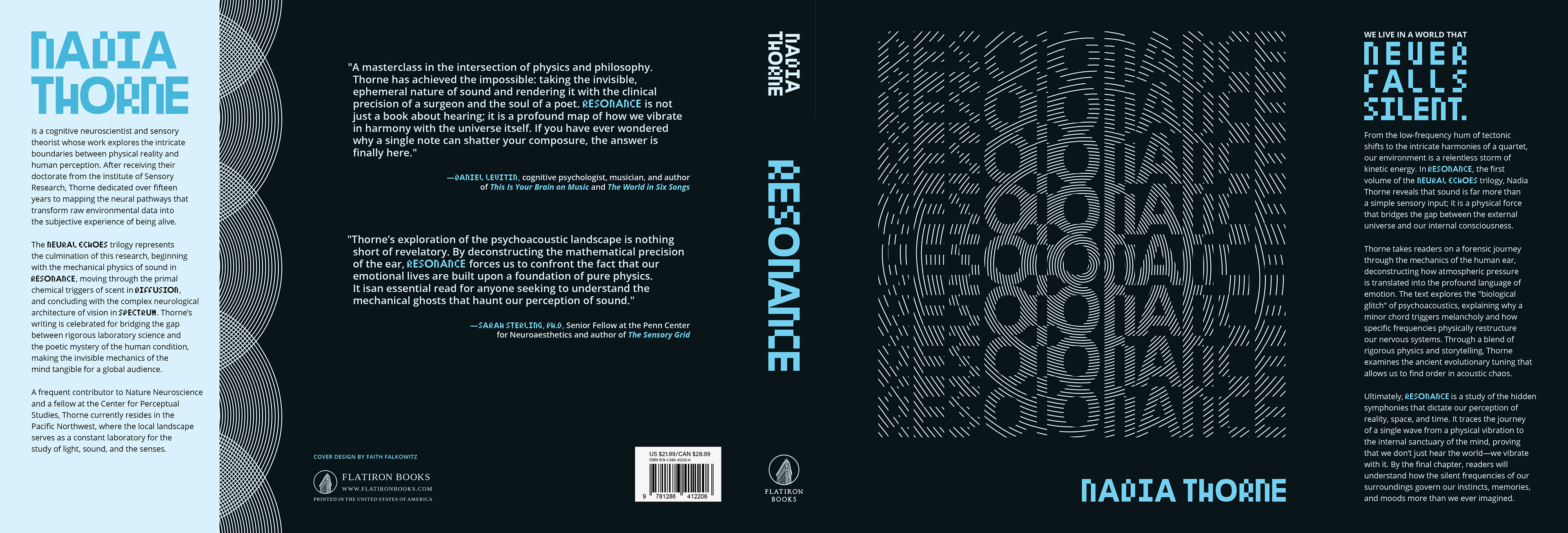
The Neural Echoes trilogy is a meticulous yet lyrical examination of the human experience, uncovering the unseen biological mechanisms that connect the physical world to our inner consciousness. Through the volumes—Resonance, Diffusion, and Spectrum—fictional neuroscientist Nadia Thorne dissects the workings of sound, scent, and vision to illustrate how our brains actively construct reality from environmental stimuli. By merging the precise science of sensory physics with profound philosophical exploration, the series delves into the "biological anomalies" and evolutionary shortcuts that influence our instincts, memories, and perceptions. Neural Echoes offers a voyage into the concealed framework of the mind, demonstrating that we are not mere observers of our surroundings but are continuously molded by the frequencies and particles that surround us.
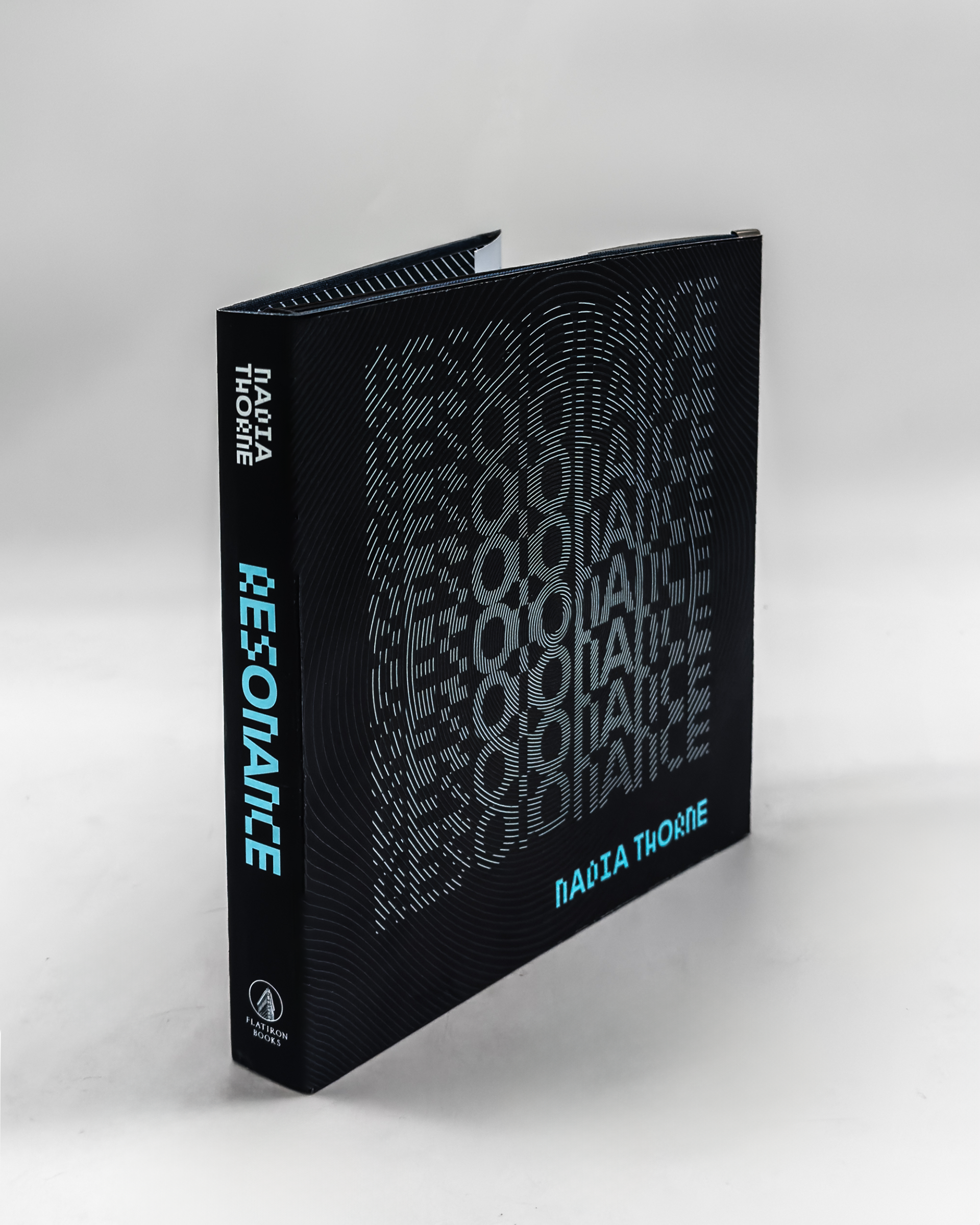
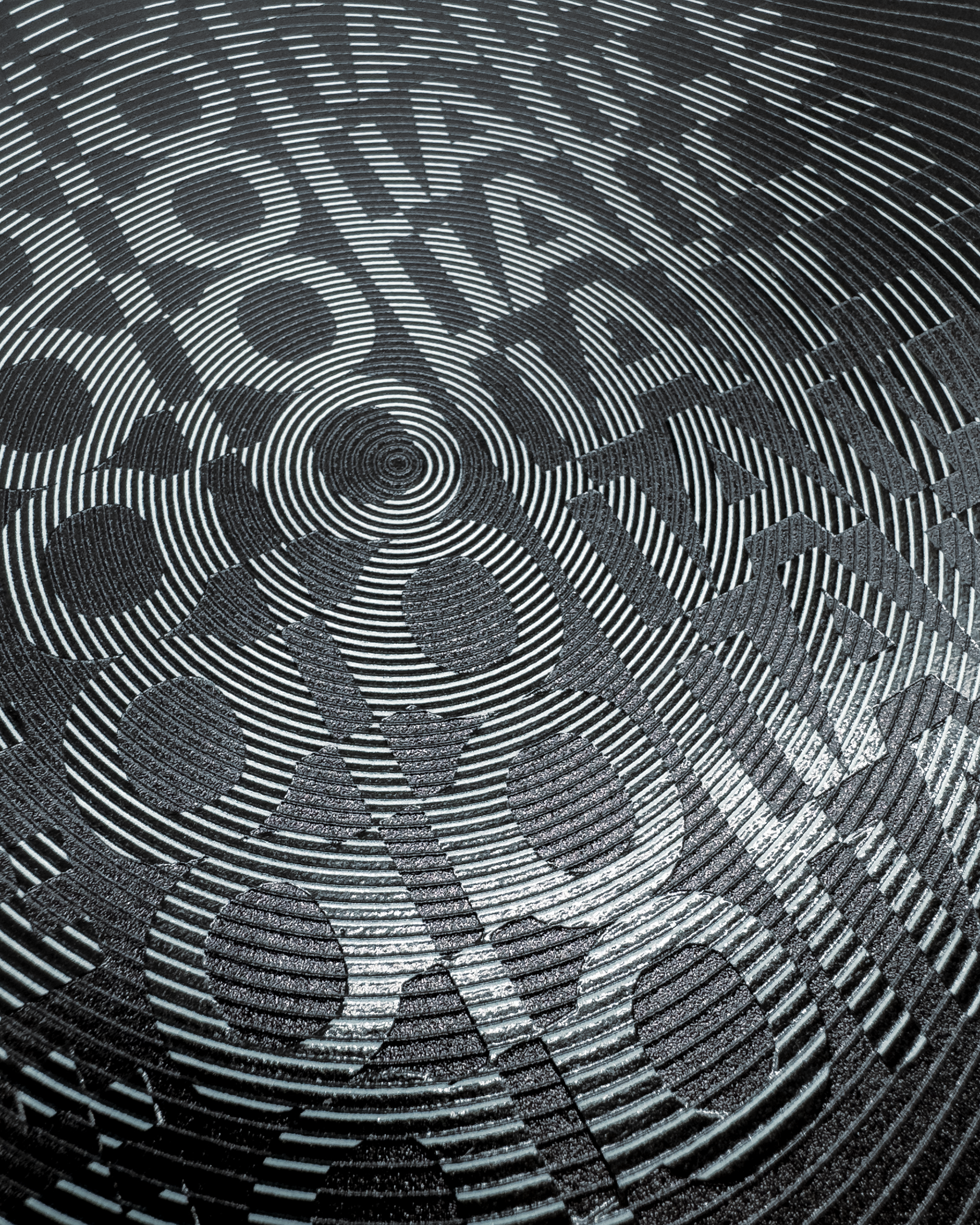
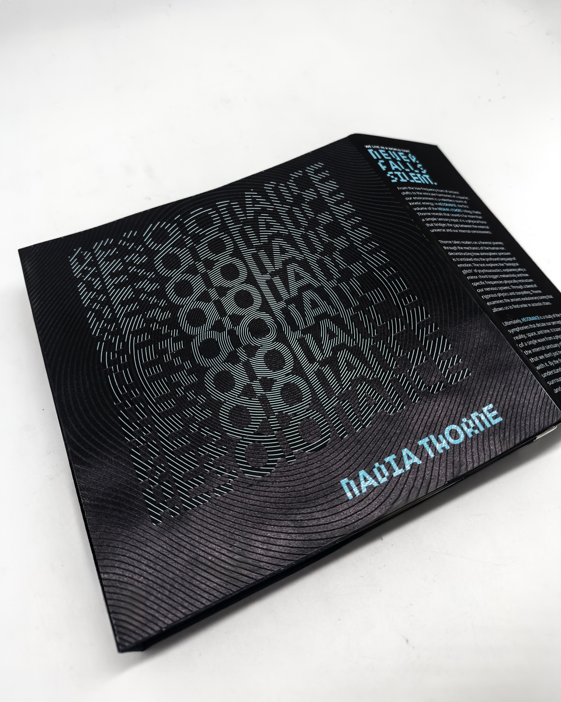
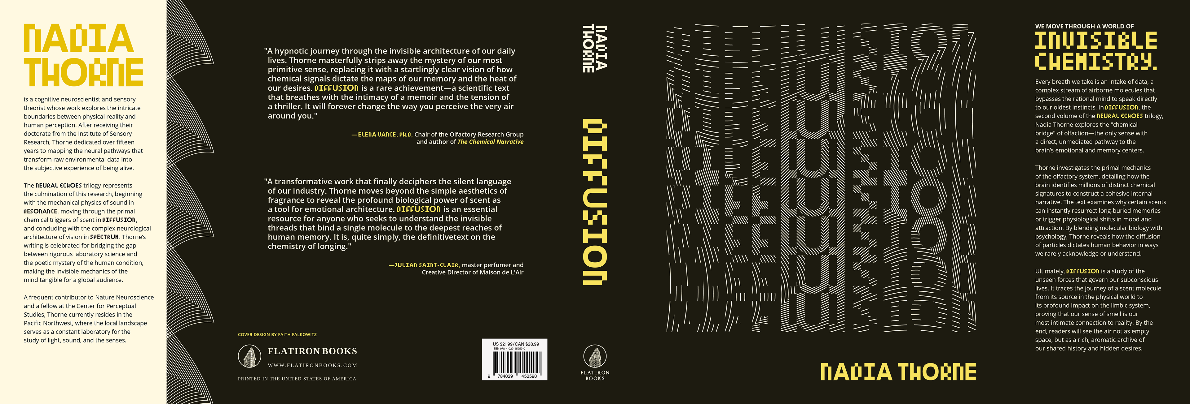
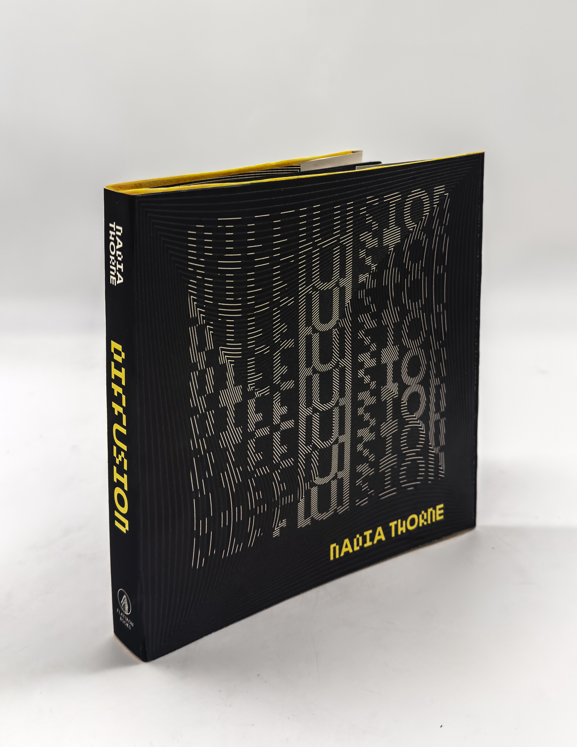
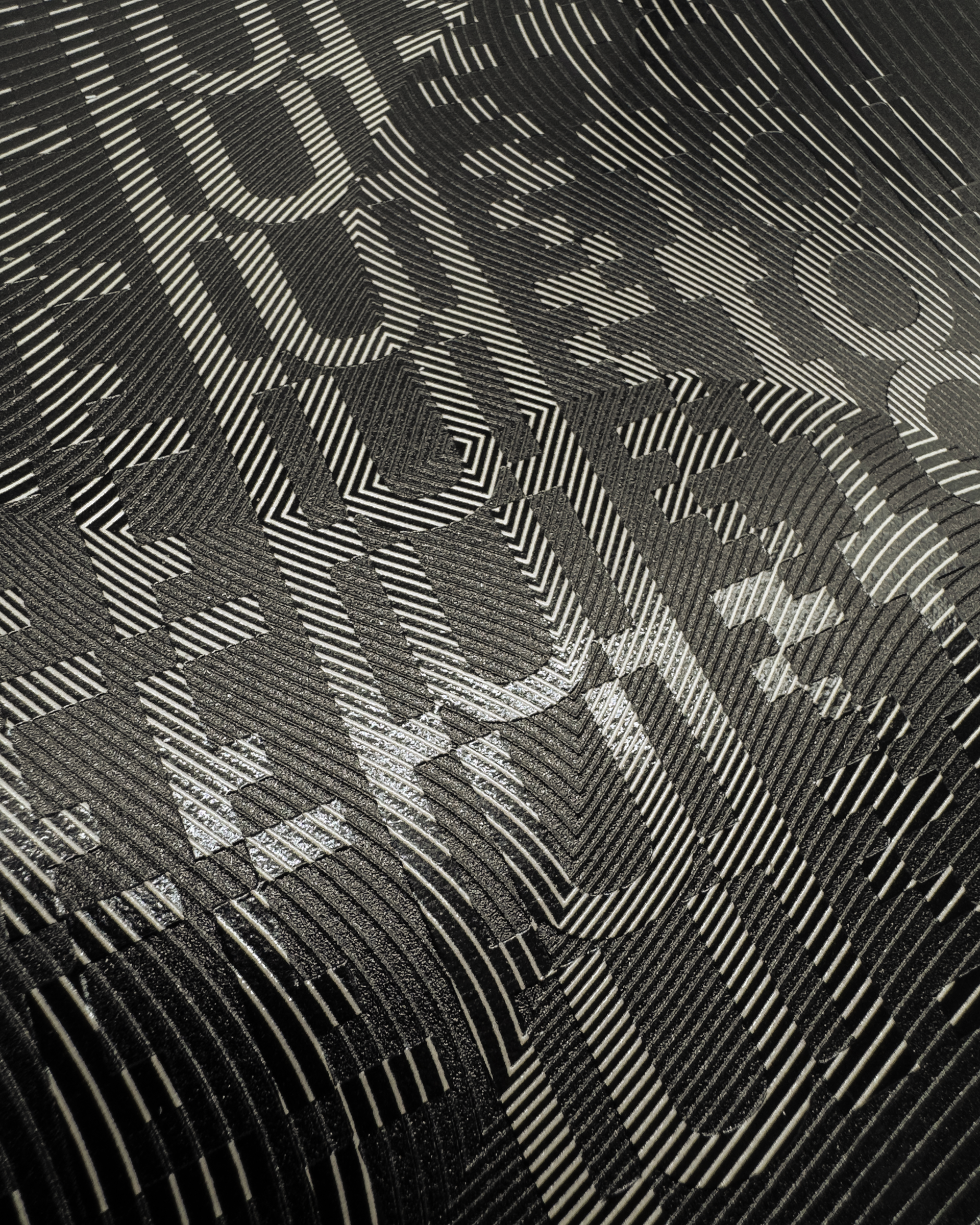
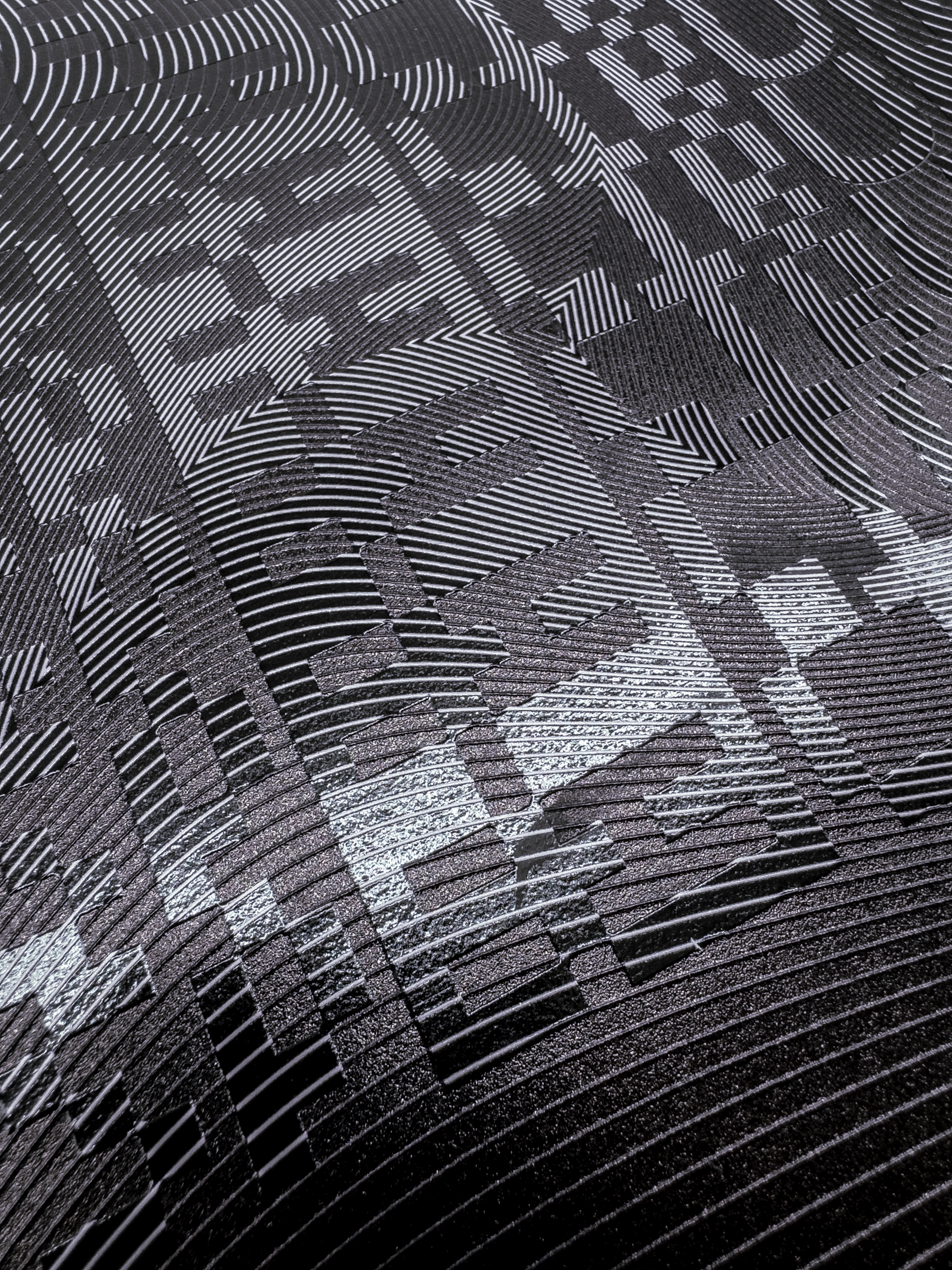
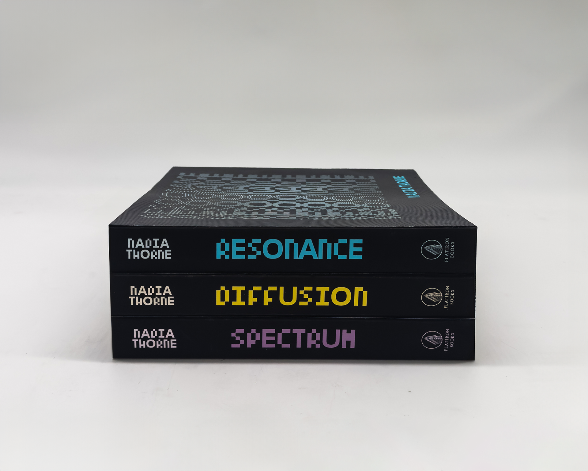
The designs translate the invisible frequencies of sound, scent, and light into physical, rhythmic interruptions across each jacket. Taking inspiration from undulating, moiré-patterned linework, the design utilizes tactile high-build spot UV to ensure every vibration is tangibly elevated. These raised striations act as a haptic map, allowing the reader’s fingers to trace the interference patterns of sensory data. By turning ethereal neural impulses into a textured, three-dimensional landscape, the books transcend mere observation, becoming tactile echoes of the very phenomena they explore.
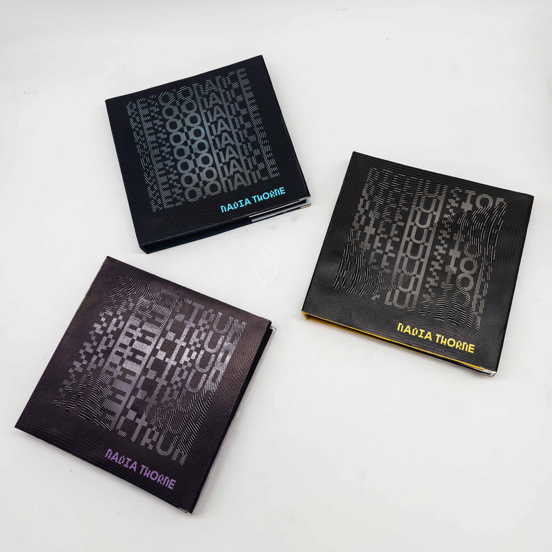
Resonance utilizes a deep blue palette to align with the visual language of digital acoustics and oscilloscopes, establishing an immediate connection to the auditory realm. This concept is physically reinforced through high-build spot UV applied in concentric, radiating circles that mimic the behavior of longitudinal sound waves and sonar pulses. By rendering these "echoes" as raised, tactile ridges, the design allows the reader to physically feel the sound's frequency and amplitude, turning a visual representation into a rhythmic, sensory experience.
Diffusion uses a yellow-based palette to evoke the olfactory profiles of citrus and vanilla, the world's most universally recognized and "bright" scent categories. This sensory association is grounded in a modular, square-grid design executed in high-build UV, which represents the molecular structure of aromatic compounds. While sound travels in waves, scent is a particulate phenomenon; the square geometry signifies the "building blocks" of a fragrance—the top, middle, and base notes—arranged in a structured lattice. As the reader's hand moves across the cover, the repeating, blocky texture mimics the way scent molecules disperse and "clump" in the air, transforming the invisible chemistry of olfaction into a tangible, geometric landscape.
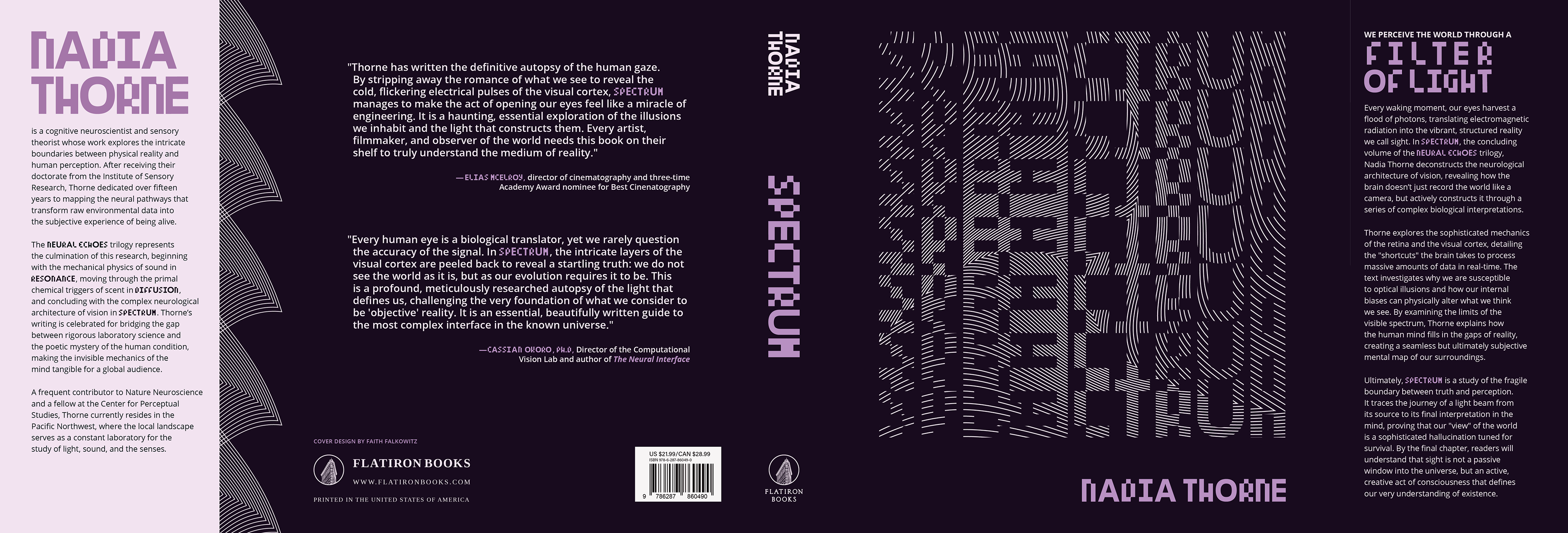
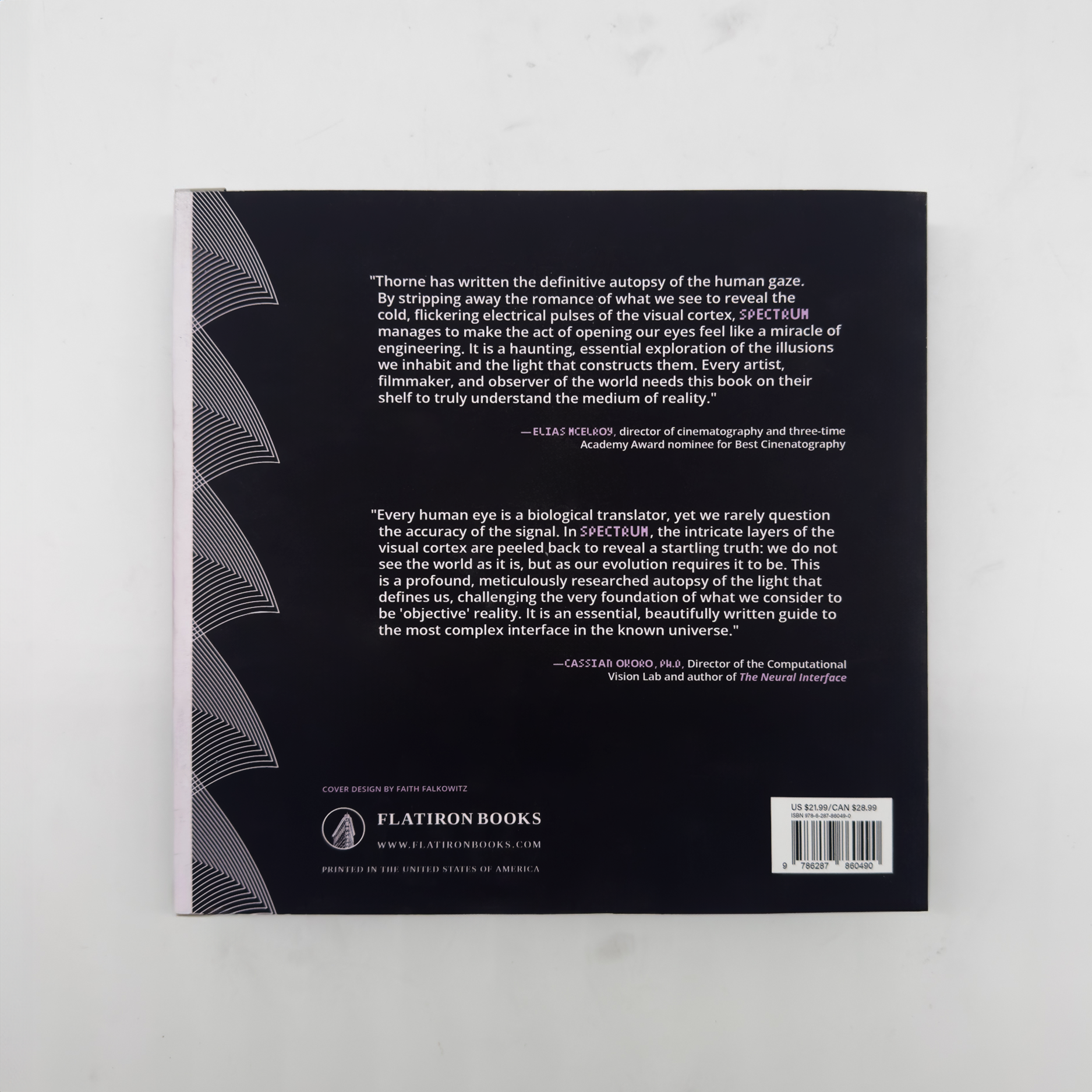
Spectrum is anchored by a deep purple palette, representing violet: the highest frequency and most energetic visible wave on the electromagnetic spectrum. This color choice signals the transition from the visible to the invisible, marking the boundary of human perception. The high-build UV design utilizes a sharp, triangular geometry to symbolize the three types of photoreceptor cones in the human retina responsible for color vision. By arranging these triangles in a refractive, shifting pattern, the cover mimics the way white light disperses through a prism. The resulting texture creates a jagged, crystalline landscape that allows the reader to physically "see" with their touch, tracing the very biological structures that translate light into color.
TYPOGRAPHY / LAYOUT DESIGN